Tara Donovan is a sculptor who creates room-filling sculptors with one multiplied object. She uses common, inorganic objects to create structures that look as though they manifested in nature. I'm really drawn to her work because of this juxtaposition. She creates work that can speak to different problems in today's world. She has the ability to make beautiful work from found objects, which is a rare talent.
Tuesday, December 3, 2013
Sunday, December 1, 2013
trompe l'oeil sea creatures
These are sweet! This artist (Keng Lye) uses resin to look like water
and paints on top of it with acrylic, and then alternates between layers of
resin and layers of paint, which is why the animals look so dimensional and
realistic. His pieces are a really neat combination of three-dimensional and
two-dimensional art. I think that it is interesting that he puts his creatures
in things like small bowls or wooden boxes, things they would not naturally go
in.
Wednesday, November 20, 2013
Janis Mars Wunderlich
I find pottery that is different than pots and plates, etc, is extremely creative. Janis focuses her work on what it is like to be an artist and a mother. She creates her pieces to be busy just like her life is. She lets her kids influence her work with "fairytales" as well as the stories she reads them. Her pieces are very character oriented, and remind me of Mother Goose stories and rhymes. They tend to be very busy pieces but very colorful and fun to look at. There is a lot of detail in her work because she works with putting many characters in one specific piece. Even though they are very busy pieces, it shows off her busy lifestyle as she intended it to.
Monday, November 18, 2013
Tim Christensen
This is thrown, porcelain pottery by Tim Christensen. I love
the drawings that he creates with the sgraffito and how they relate to the
form. Because the drawings are busy and detailed, he keeps the ceramic forms
fairly simple, occasionally extending the qualities of the image into the form
itself. Many of his pieces seem to contrast sky and sea, a concept that is
represented well with the black and white values. I like how the artist uses
various lines and patterns to create value, this makes the pieces very
interesting and exciting to look at.
Wednesday, November 13, 2013
Nancy Y. Adams has pieces that remind me of something you would find in Wonderland. They have an aquatic theme with very nice colors. They aren't bright but the colors go extremely well together. She uses a lot of frogs and flowers on her pieces with blues to bring out the aquatic part of the piece. They are beautifully crafted.


I am very drawn to pieces that have bright, vibrant colors. Vaughan Nelson makes clay pieces and then glazes them in a very particular way. He has nice, solid shapes and accents them with the fun colors. Some of the pieces remind me of a childlike state. I especially like the cream and white piece that has the extravagantly colored ball on top. His pieces are just fun to look at, and would be great to have around the house to add that pop of something special.


Margaret Gallivan is a jewelry artist who uses wire twisting to make her pieces unique. I enjoy these pieces because I understand how difficult it can be to manipulate and twist wire to the direct spot that you want it. her pieces have more of a classical beauty to me. They also have a sense of simplicity. She knows that the pieces are beautiful enough on their own so Margaret only accents them with a small jewel.

Katie Poterala is a contemporary jewelry artist. Her pieces are made to bring in colors and shapes from childhood but mix them with decay and beauty from today. She likes to incorporate history along with childhood feelings in her work. I find her pieces especially beautiful. The mix between the bright colors of the jewels with the decayed part of the body the piece is a great contrast.

Monday, November 11, 2013
Interesting Glaze Ingredients
When I was looking for glaze recipes I found this article
about an artist who uses unique ingredients in his glazes. Many of the things
that he includes can be found at the grocery store. He even uses kitty litter sometimes!
The second image is my favorite; the pattern that he created makes the piece so
interesting. I like the way that he glazes many of his pieces as the shapes or
texture formed by the glazes are intriguing and eye-catching. The glazes on
this particular one include Rolaids and Alka-seltzer.
I enjoy looking at artists work when their pieces have a deeper meaning. This is what I found with artist, Susan Wortman. She is a breast cancer survivor and from that she started her line of "winged women" which is clay pieces that are the bodice of a woman with wings. The pieces are exact copies of what you would think of a woman's bodice and wins are. They are more organic in a sense that at first the pieces would be thought provoking if you didn't know the title. The pieces have a look of destruction to them and not fully complete which is representing what having the cancer does to woman.
Here is the link to her pieces. http://www.susanwortman.com/susanwortman.com/Gallery/Pages/Winged_Women_Series_3.html#3
Katharine Beisner has pieces that play with the eye and color. Some artists find it more appealing to use classic shapes that people can pinpoint and describe rather than using abstract shapes. Katharine does this. By adding color of the same family she creates a piece that looks more flat and uniform. By having colors that aren't necessarily from the same family, she creates more of an eye interesting piece. The green and earth tone aren't in the same family but they can be found in nature places together which is why this piece works. If she would have used any other colors, the piece would not have flowed the way that it does.


Joyce Bickel has some very beautifully done pieces. They are elegant in such a smooth, pristine way. The white of the main part of the body interacting with the accent colors makes the viewer want to touch the piece to feel how the flow is working. She uses a loose geometric shape which adds to the fluidity that the pieces feel like they have. These pieces to me feel as if they are sort of an old fashioned pieces in that I can see my grandmother having one of Joyce's boxes on her vanity holding pieces of jewelry.
Here is the link to view her art work. http://www.castleclayartists.net/Artist.asp?ArtistID=20959&Akey=HKACJ6VA
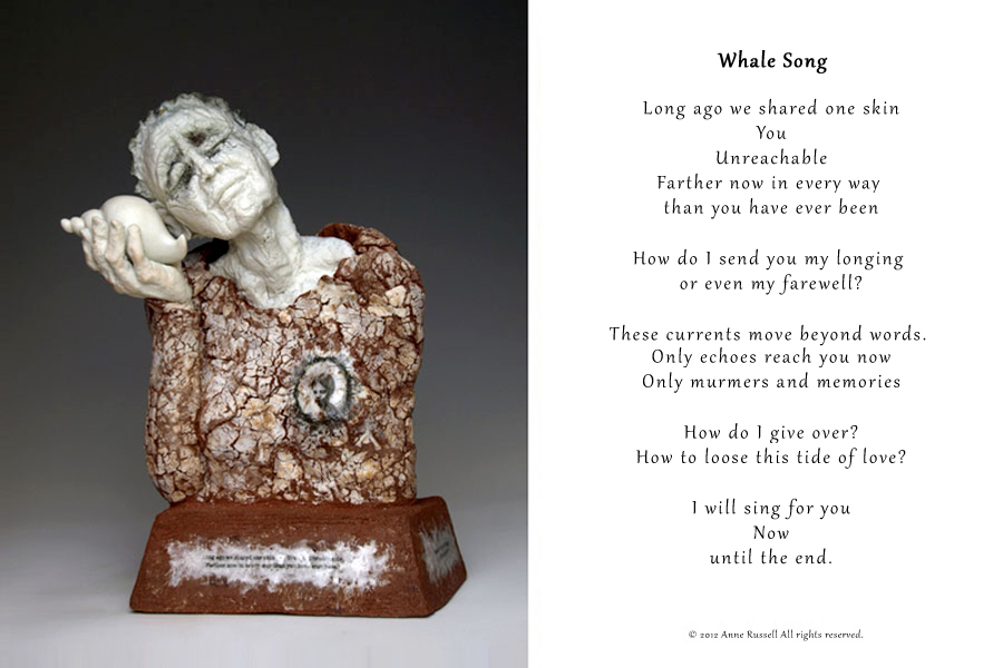
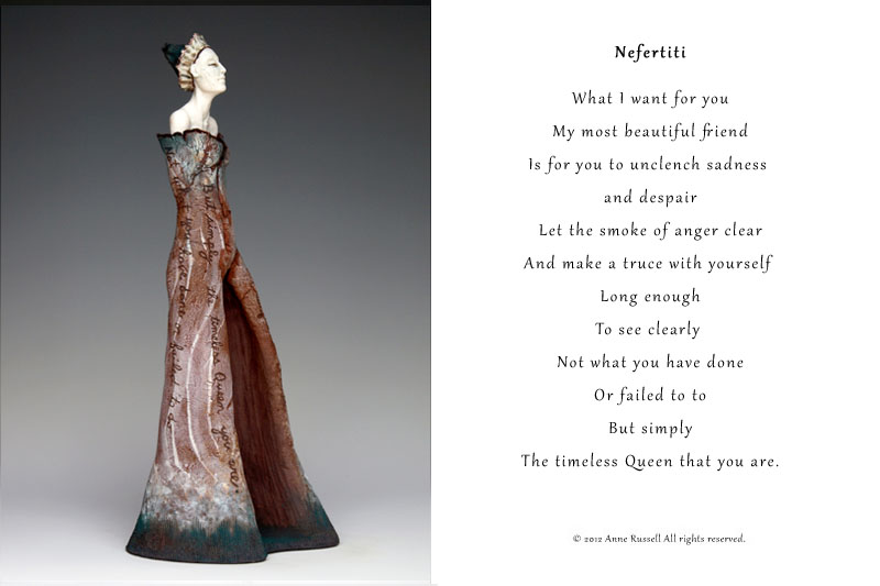
Anne Russell has an unique look on her art pieces. Most of her pieces show humans surrounded by some sort of rough or rugged looking piece. The view Anne is trying to get across is that humans strive for perfection but often they are faced with difficulties. The smooth, porcelain part of the human is representing the perfection that the humans are striving for, but the rough background pieces that are often cracked shows the difficulties and the problems that the humans are facing. These pieces make the viewer think and self reflect on their own lives.
I really like the works of the contemporary artist, Barbara Campbell. She has lived in a village of New Mexico for the last 30 years and her pieces really resemble this. I like how the pieces are a more natural, earth toned color with a pop of something bright and playful. Her pieces also have small scenes engraved which I feel she brought from living in her village.


Kathy Butterly
These pieces by Kathy Butterly are some of my favorite pieces of hers. They are incredibly interesting to look at. They give a new definition to organic shapes. Her use of many colors on her pieces draw your eyes to the work, as well as give you multiple perspectives to look at. Her pieces are very cartoon-like, which can attract the viewer to look at the piece for long periods of time. The reason I picked her pieces is because I think her work is very eye catching and they make me want to figure out the representation of each one.
Saturday, November 9, 2013
Hi Everyone, just wanted to post this link for a Japanese commercial-
that someone just sent me.
I appreciate work that is creative and simple, and uses limited technology
and if it has a bit of "fun"to it- that's always a good thing : ) cheers for now,
Japanese commercial
that someone just sent me.
I appreciate work that is creative and simple, and uses limited technology
and if it has a bit of "fun"to it- that's always a good thing : ) cheers for now,
Japanese commercial
Thursday, November 7, 2013
Clarice Cliff
This is the pottery of Clarice Cliff. I think that these art
deco pieces are so fun. The colorful patterns interact with the geometric forms
to create pottery that is playful and certainly very interesting to look at. Even though her pottery was marketed to
common people for everyday purposes, these are so much more than practical
dishes. I read that she got her start by offering to paint defective ceramic
pieces so that they would be more likely to sell. She covered them up with rich
colors and busy geometric shapes. She was very creative!
Friday, November 1, 2013
Arnold Annen
This is the work of Arnold Annen.
I believe that this artist uses porcelain, and makes it so thin that it becomes
translucent. Because of the bowls’ form and translucency, interesting things
are occurring with light and shadow. They almost look as though they are
producing the light or are illuminated from within. The pieces are simple and
delicate, which heightens their ethereal and luminous quality. They almost remind
me of lamps.
Monday, October 21, 2013
Sayuri Sasaki Hemann
Sayuri Sasaki Hemann is an artist whose recent work involves
installations that depict aquatic scenes and creatures, things that she often
draws her inspiration from. She creates her artwork from sewn fabric and felted
wool. These images are from a recent installation in the Portland
International Airport. I think that it is amazing how she creates such an
ethereal, intricate environment just with her hands and simple materials. It is
also interesting how she places these environments in unexpected places, such
as the airport. Sayuri currently has a show at the Paper Nest here in Iowa
City.
http://www.sayurisworld.com/projects_urban.html
Saturday, October 5, 2013
Beatrice Wood
Hi! This pottery is from artist Beatrice Wood. She lived
until she was 105 and was making art up until then. She lived a really
interesting life and hung out with people like Duchamp and Man Ray. What I like about her pieces is that
they are fairly simple in form, which allows her beautiful, lustrous glazes to
be on full display. She experimented with and concentrated on creating these
luster glazes. Some of her pieces have many handles, which I think adds a bit
of whimsy and personality and also creates movement that makes them so
interesting to look at.
Subscribe to:
Posts (Atom)